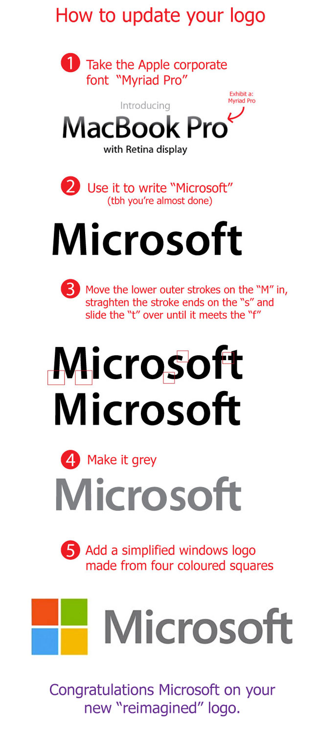
A few years back, before all this twitter and Tik Tok nonsense (yeah, I said it). I made a blog post that got some traction.
Basically in 2012 Microsoft changed their logo and immediately I recognised the font as very similar to Myriad Pro, a font that had become uber-recognisable as ‘Apple’s font’. If you were a graphic designer at the time you couldn’t miss it. In fact it was so synonymous with Apple that it became the Mark Hamilton of fonts. After “Star Wars” Mark became iconicaly recognisable as Luke Skywalker and similarly Myriad Pro was so Apple that even though designers the world over (myself included) we’re using it (because it made everything look good), it also made everything look like it was owned/made by Apple. You saw myriad pro, you saw Apple.
In 2012 Microsoft updated their logo. When I saw it, I saw Apple, I saw Myriad Pro (I was wrong). I overlayed their new logo onto the word Microsoft simply type out in Myriad Pro and sure enough most of it was bang-on. So I made a simple image to show how [not very] different Microsoft’s new logo was from Apple’s long-used corporate font.
Although it turned out it wasn’t Myriad Pro (the font used is called Segoe), but um, well, Segoe just looks like a copy of Myriad Pro.
The question that I still have in my head is. Did Microsoft do it that intentionally? I mean, for years Myriad Pro had been dutifully making Apple’s adverting and marketing look amazing! During this time I thought; Why does Microsoft never manage to get gud in this area? Well it turns out they did, by choosing a font instantly recognisable as Apple-esque because of how closely it matched Myriad Pro. I wonder if they did that consciously in an effort to follow Apple’s winning recipe (this time with design elements), or had they been trying for so long to catch up with Apple design that when they selected a new logo font they happened to find themselves choosing the one that was very close to Apple’s without even realising it.
In fact Microsoft hand been using Segoe officially since 2004 before it was eventually adapted into their logo. When did Apple start using Myriad Pro as their corporate font you ask? Apple started using Myriad Pro in 2002. Microsoft adopted their very similar font just two years after Apple. I smell a “fast follow”.
For your font knowledge, Segoe isn’t so much a copy of Myriad Pro as a copy of Frutiger and all three fonts are incredibly similar. You will need to “do your own research” for further info on that. It’s above my pay grade.
Here is my little observation about the whole thing: